Gender ratios affect dating more than you think
Stereotypically, dating in the Bay Area is pretty rough for straight men – too many tech workers competing for too few women. And indeed, the Bay Area has about 6% more men than women in their 20s. London and New York, meanwhile, both tilt female by about 5%. But does an 11% difference in the ratio really matter? Turns out it does – a lot!
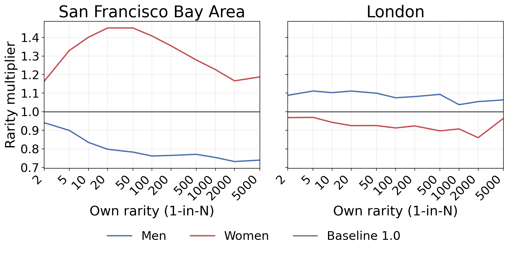
In my simulation, a 99th percentile woman (so, 1-in-100) moving from London to the Bay Area can expect to match with someone ~50% rarer (1-in-92 → 1-in-136). Meanwhile, a 99th percentile man sees his match become ~33% less rare (1-in-108 → 1-in-73).
1. Measuring dating success through “rarity”
Imagine ranking everyone on general desirability: some mix of attractiveness, intelligence, happiness, and other valued traits. We don’t need to define this precisely — it’s enough that some rough ordering exists.
If you’re “1-in-100” among your gender, you’re in the top 1% of men or women. (Quick reference: 1-in-2 = 50th percentile, 1-in-10 = 90th percentile, 1-in-100 = 99th percentile.)
Naively, a 1-in-100 man should match with a 1-in-100 woman. In a perfectly balanced market with equal numbers, this is roughly what happens. But what about imbalanced markets?
2. Modeling the market
To figure this out, I built a model with three components:
1. Gender imbalance (from actual population distributions): Using census data for the 20-30 age range, London has about 5% more women than men, while the Bay Area has about 6% more men than women – 106 men per 100 women. (Background tidbit: the ratio at birth is ~105 boys per 100 girls, so even at birth it isn’t equal. By adulthood ratios are mostly driven by migration and mortality; we just use the numbers from census data.)
2. Newcomer effects: The type of people a city attracts matters too. The Bay Area attracts many high-achieving tech workers who are predominantly male. I model all these newcomers (both men and women) as averaging around the 90th percentile desirability with 70% of the typical spread – high-achieving but not as diverse as the general population. London’s female surplus is probably more similar to the base population – possibly arising from higher female university attendance – so I model those newcomers as typical.
3. Already paired: About 40% of people in this age range are already in relationships. This is key: when you remove equal numbers of men and women as couples, any initial imbalance becomes more pronounced among singles.
Say there are 106 men and 100 women. If 40 are paired from each side, you are left with 66 single men and 60 single women – amplifying the 6% surplus to 10%.
3. Results
Let’s see what happens to our hypothetical 1-in-100 person when people pair off with the most desirable available partner who will accept them (also called perfect assortative matching).
For someone who is 99th percentile (1-in-100):
- Man moving London → Bay Area: Goes from matching with a 1-in-108 woman to a 1-in-73 woman
- Woman moving London → Bay Area: Goes from matching with a 1-in-92 man to a 1-in-136 man
These are dramatic differences! The Bay Area man’s typical match is about 33% less rare (worse), while the woman’s match is about 48% more rare (better).
The effects vary by your own desirability:
In table form:
Show men's results table
| Your desirability percentile (rarity) |
London match | Bay Area match | Rarity multiplier (London → Bay) |
|---|---|---|---|
| 50th (1-in-2) | 54th (1-in-2.2) | 42nd (1-in-1.7) | 0.79× |
| 80th (1-in-5) | 81.6th (1-in-5.4) | 74.8th (1-in-4.0) | 0.73× |
| 90th (1-in-10) | 90.8th (1-in-10.8) | 86.8th (1-in-7.6) | 0.70× |
| 95th (1-in-20) | 95.4th (1-in-21.7) | 93.2nd (1-in-14.7) | 0.68× |
| 98th (1-in-50) | 98.2nd (1-in-54.2) | 97.2nd (1-in-36.3) | 0.67× |
| 99th (1-in-100) | 99.1st (1-in-108.5) | 98.6th (1-in-73.1) | 0.67× |
| 99.5th (1-in-200) | 99.5th (1-in-217) | 99.3rd (1-in-148) | 0.68× |
| 99.8th (1-in-500) | 99.8th (1-in-542) | 99.7th (1-in-381) | 0.70× |
| 99.9th (1-in-1000) | 99.9th (1-in-1085) | 99.9th (1-in-781) | 0.72× |
Show women's results table
| Your desirability percentile (rarity) |
London match | Bay Area match | Rarity multiplier (London → Bay) |
|---|---|---|---|
| 50th (1-in-2) | 45.7th (1-in-1.8) | 57.5th (1-in-2.4) | 1.28× |
| 80th (1-in-5) | 78.3rd (1-in-4.6) | 84.4th (1-in-6.4) | 1.39× |
| 90th (1-in-10) | 89.1st (1-in-9.2) | 92.5th (1-in-13.4) | 1.45× |
| 95th (1-in-20) | 94.6th (1-in-18.4) | 96.3rd (1-in-27.4) | 1.49× |
| 98th (1-in-50) | 97.8th (1-in-46.1) | 98.5th (1-in-68.7) | 1.49× |
| 99th (1-in-100) | 98.9th (1-in-92.2) | 99.3rd (1-in-136) | 1.48× |
| 99.5th (1-in-200) | 99.5th (1-in-184) | 99.6th (1-in-268) | 1.45× |
| 99.8th (1-in-500) | 99.8th (1-in-461) | 99.9th (1-in-651) | 1.41× |
| 99.9th (1-in-1000) | 99.9th (1-in-922) | 99.9th (1-in-1269) | 1.38× |
Notice that even median people (50th percentile) see small effects – about 20-25% changes in partner rarity. But the effects grow substantially as you move up the distribution, peaking around the 95th-98th percentiles.
4. Why the effects are so large
Two forces drive this:
1. Raw numbers: The Bay Area simply has more single men than single women. In any matching market, the scarcer side gets better matches. It’s supply and demand.
2. Distribution shape: The Bay Area draws a lot of high-achieving tech workers, mostly men. This makes the top of the male distribution especially crowded. A 95th percentile man courting a 95th percentile woman in the Bay Area faces more competition from 96th, 97th, and 98th percentile men than he would in a city with a more typical distribution.
The multiplier curve above (left) shows this isn’t uniform – effects are minimal for average people, grow substantially through the 90th percentiles, then again diminish slightly at the very top.
Could the effect strength be an artifact of perfect assortative matching? Real dating involves a lot of randomness unique to each couple (e.g. unusually great chemistry). Turns out including randomness in the model doesn’t change the headline result – “rarity multipliers from moving cities” stay very similar to the ones we got above without randomness (more detail in Appendix B).
5. Percentiles vs. rarity: how big are these effects really?
There’s an interesting tension in how to interpret these results. In percentile terms, the changes look modest – going from matching with the 99.1st percentile to the 98.6th percentile doesn’t sound like much. But in rarity terms, that same change (1-in-108 to 1-in-73) means your partner is 33% less rare.
Which framing matters more for real life? It’s genuinely unclear. Relationships are much more than the sum of desirability scores – the interaction, vibes, chemistry, and feelings matter enormously. For any individual relationship, those factors likely swamp these statistical differences. But across the population, they still noticeably shift your dating options.
6. Caveats
This post presents a very simplified model of a complex social phenomenon:
- Model ignores age preferences: Men typically pursue younger women, while women typically prefer men their own age or slightly older. Since there are more men than women at most ages in the Bay Area, this amplifies competition as men across different ages often pursue the same younger women. In London, this dynamic could mean tougher competition among older women.
- Matching singles instead of those looking to date: These numbers differ in practice. Relatedly, singlehood rates vary by age and sex. When constructing the singles pool, I remove the same number of partnered men and women as couples; in reality, those numbers may differ (e.g. women often marry earlier).
- Not modeling some people opting out if they cannot find a suitable match (instead of “dating down”): including this would dampen the core effect, but probably not by much.
- Geographic lock-in: Assumes you can’t date across cities.
- Single axis of desirability: In reality different people value different things; there are many communities with somewhat different desirability axes.
- Newcomer assumptions: The Bay Area tech migration parameters (90th percentile mean, 0.7× standard deviation) are educated guesses.
There are also cultural factors. Even with favorable ratios (e.g. women in the Bay Area), dating might feel harder when many in the available pool don’t share your relationship priorities or timeline.
Still, the basic point stands: seemingly small demographic shifts can have outsized effects on dating markets, especially at the top of the distribution.
7. The bottom line
Geography affects dating more than I expected. Of course other stuff like career, social networks, and lifestyle matters too. But for those wondering whether gender ratios actually matter – yes, they do, and probably more than you thought. If you’re single and thinking about a move, this factor might be worth considering.
Appendix A: try it yourself
Show singles calculation
We calculate the number of singles by removing the same number of ppl from both genders as paired couples.
First, calculate how many couples to remove:
couplesToRemove = (1 - singlesShare) × (menTotal + womenTotal)/2
(capped at the smaller population to ensure we never remove more people than exist). Then we just subtract couplesToRemove from both:
menSingles = menTotal - couplesToRemove
womenSingles = womenTotal - couplesToRemove
For example, if Singles = 60%, then 40% are paired. With 110,000 men and 104,000 women (total 214,000), we get couplesToRemove = 0.4 × 214,000 / 2 = 42,800. Subtracting 42,800 from each gender leaves 67,200 single men and 61,200 single women. This amplifies the original 6% imbalance (110k:104k) into a 10% imbalance among singles (67.2k:61.2k).
Appendix B: gender ratio multipliers are surprisingly robust to noisy matching
I tested whether the large change in expected partner rarity between the cities is an artifact of the “perfect assortative matching” toy model used above. Analysis below suggests it’s not an artifact.
In the main analysis, everyone agrees perfectly on desirability rankings. To test robustness, I added preference noise.
Preference noise model
Each person ranks every member of the opposite gender. Their utility for each potential partner equals log(rarity) – so 1-in-100 people have utility log(100) ≈ 4.6, while 1-in-10 people have utility log(10) ≈ 2.3.
I add random noise (normal distribution, SD=1.0) to these utilities before ranking. This means someone might prefer a 1-in-30 person over a 1-in-100 person about 15% of the time (1.4 standard deviations apart).
For median people (log-rarity ≈ 0.7), the noise dominates – preferences become mostly random. For 99th percentile people (log-rarity ≈ 4.6), noise is ~20% of signal strength.
Results: noise causes compression but preserves multipliers
I ran 15k simulations of a scenario where 1) each person in a population of 25k noisily ranks all members of the opposite gender, and 2) people are matched based on their preferences with the Gale-Shapley algorithm.
Even without any imbalance – with identical distributions and ratio=1 – noise causes substantial regression to the mean: e.g. a 1-in-100 person of either gender usually matches with someone between 1-in-53 and 1-in-62. See full table below.
Show noise model table
| Your Desirability | Perfect Sorting | With Noise |
|---|---|---|
| 1-in-2 | 1-in-2 | 1-in-1.8 to 1-in-1.8 |
| 1-in-5 | 1-in-5 | 1-in-3.1 to 1-in-3.4 |
| 1-in-10 | 1-in-10 | 1-in-5.8 to 1-in-6.6 |
| 1-in-20 | 1-in-20 | 1-in-11 to 1-in-13 |
| 1-in-50 | 1-in-50 | 1-in-27 to 1-in-32 |
| 1-in-100 | 1-in-100 | 1-in-53 to 1-in-62 |
| 1-in-200 | 1-in-200 | 1-in-103 to 1-in-121 |
| 1-in-500 | 1-in-500 | 1-in-244 to 1-in-297 |
| 1-in-1000 | 1-in-1000 | 1-in-473 to 1-in-543 |
| 1-in-2000 | 1-in-2000 | 1-in-907 to 1-in-1083 |
| 1-in-5000 | 1-in-5000 | 1-in-2076 to 1-in-2626 |
When taking imbalanced distributions into account, the multipliers (expected match’s rarity in the Bay divided by match’s rarity in London) for our 1-in-100 people from before remain stable despite the noise:
- Men moving London → Bay: 0.71× partner rarity
- Women moving London → Bay: 1.54× partner rarity
This is nearly identical to perfect sorting, despite substantially randomized preferences and overall regression to the mean in both cities. Plot like the one in the Partner rarity multiplier figure in the main post:
(Note that since there are only 25k people in this simulation, results for rarities over 1k are quite noisy. To reduce noise and bias, half of my Gale-Shapley runs set men as “proposers”, and women are proposers in the other half.)
Why this persists
Persistence of the part of the effect attributable to basic gender ratios is not surprising – 110 men competing for 100 women creates imbalance regardless of preferences.
The puzzle: distributional effects also persist. The Bay Area’s concentration of high-achieving men still creates asymmetric effects, even with noisy preferences. I expected this to mostly wash out – it doesn’t.
The mechanism remains somewhat unclear – though the language models I consulted say these results (persistent substantial difference in dating success) aren’t that surprising given our specific model of noisy preferences and the related works discussed in the next section.
Implication: demographics matter a lot even when individual preferences are highly idiosyncratic.
Appendix C: related work
- The post “Skewed and the Screwed” from Falkovich (2020) is a great complement to this one. Both posts highlight the same amplification effect: once couples pair off, initially-small gender gaps grow larger among singles. From there, Falkovich looks at age preferences and political tribes, while I take a quantitative angle – simulating cities and desirability distributions.
- This post on the OkCupid blog (Markowitz, 2017) explores people’s age preferences using data you can probably only get when running a dating site (who messages who + response rates, broken down by age of both the sender and the recipient). The post argues that breaking the “older-man-younger-woman” norm is pretty easy, and is often beneficial.
-
There is also the Discourse:

Relatedly, Grimes: “Someone said to me that the way to import 40 thousand art hoes to SF to teach engineers love (and thus save humankind) would be to open an elite fashion school. Considering the materials science infrastructure this is actually the obvious path forward for fashion”
Econ papers
Many econ papers are relevant for the dating market model presented in this post. Warning: I made paper summaries below using a good bit of LLM assistance, so the chance of inaccuracies is higher than usual.
- Choo & Siow – “Who Marries Whom and Why” (2006): A marriage model incorporating both overall gains from pairing up and couple-specific “chemistry,” showing how demographics move who pairs with whom and who stays single, estimated on 1970s U.S. data. It explains why adding “chemistry” makes matches less tightly aligned by rank – top people don’t always pair with top people – but the direction of sex-ratio effects still shows up, matching my robustness checks in Appendix B. Journal of Political Economy
- Galichon & Salanié – “Cupid’s Invisible Hand: Social Surplus and Identification in Matching Models”: Generalizing Choo–Siow, the paper provides practical tools for estimating how head-count or entrant-mix shifts change real matching markets (focusing on who matches with whom, and how much benefit they derive from it). Review of Economic Studies
- Azevedo & Leshno – “A Supply and Demand Framework for Two-Sided Matching Markets” (2016): Large matching markets behave like admissions: each side’s selectivity shifts until offers and acceptances line up. Change head-counts or who enters (e.g., more high-achieving men in the Bay Area) and those selectivity levels move predictably – somewhat similarly to what shows up as my “rarity multipliers.” Journal of Political Economy
- Menzel – “Large Matching Markets as Two-Sided Demand Systems” (2015): In large markets with idiosyncratic tastes, aggregate patterns converge to a unique outcome even though many micro matchings could exist. Individual randomness is real, but market-level averages are tightly pinned down. This maybe helps explain why my rarity multipliers barely change after adding preference noise in Appendix B. Econometrica
- Ashlagi, Kanoria & Leshno – “Unbalanced Random Matching Markets: The Stark Effect of Competition” (2017): In large markets with largely independent rankings, even tiny numerical tilts create big advantages for the scarcer side, and the stable outcome is essentially unique. With just one extra person (n vs. n+1), the scarce side’s average match is around their ~7th choice while the numerous side’s is ~145th when n=1,000. Journal of Political Economy
Appendix D: data sources
The Gender ratio explorer chart combines male/female population by age for major urban areas using official sources.
Show sources
National sources
- U.S. Census Bureau (American Community Survey 5-Year, 2023 via the Census API)
- UK ONS Mid-Year Estimates (2024)
- Statistics Canada (2021 Census)
- Germany Census 2024 (DESTATIS GENESIS, Table 12411-0018 (02-03-4))
- Australia: Sydney, Melbourne, Brisbane, Perth, Adelaide – 2021 Census (ABS)
- France: Paris Region, Paris (Commune), Marseille – 2021 (INSEE RP2021)
- Belgium: Brussels Region – 2025 (as of Jan 1, Statbel)
City-level releases
Age bins are normalized into single-year ranges with linear interpolation where ground truth data is not granular enough.